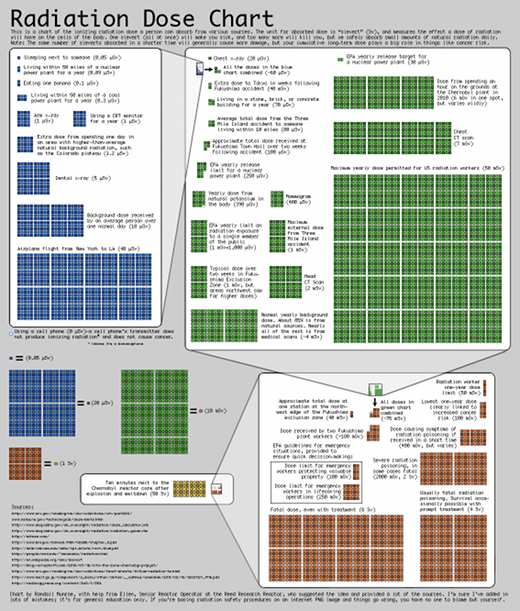
In the wake of the Fukushima nuclear disaster, xkcd posted this infographic to help clarify the doses of ionizing radiation people receive from various sources. Click on the image to be redirected to the large-format original. As a resident of West Virginia, I found it especially interesting that a person living within 50 miles of a coal fueled power plant receives three times the radiation dose annually than a person living within 50 miles of a properly functioning nuclear power plant.
Previous Post: Cargo Bridge
